Texas change the cover of Texas 25
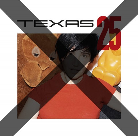
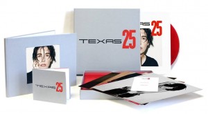
Perhaps it was only a mock-up after all, or maybe Sharleen Spiteri reads SDE, but whatever the situation there is now a NEW front cover for Texas 25 to replace the much criticised previous version that featured in the press release and was used on the band’s official site/store.
Yes, the old cover – described by SDE readers as “horrendous”, “tacky” and “worst album sleeve of the year” – is now history and this new version (below) is what will feature.

A massive improvement we think you’ll agree. We should add that the criticisms voiced were about colours, composition and having that stupid monkey and yellow thing in the picture and were nothing to do with the lovely Ms Spiteri. Having said that, the replacement undoubtedly features a more flattering photo.
Texas 25 will included 12 re-recorded hits (plus more content on other editions) and will be released on 16 February 2015.
Super Deluxe Edition box set
2CD Deluxe Edition
- • UK Pre-order: Texas 25
- • USA Pre-order: Texas 25
- • CANADA Pre-order: Texas 25
- • GERMANY Pre-order: Texas 25
- • FRANCE Pre-order: Texas 25
Red Vinyl Edition
- • UK Pre-order: Texas 25
- • USA Pre-order: Texas 25
- • CANADA Pre-order: Texas 25 (Vinyl)
- • GERMANY Pre-order: Texas 25
- • FRANCE Pre-order: Texas 25
Single CD Edition
Track listing
CD1 / LP
THE TRUTH & SOUL SESSIONS
1.Start A Family
2. Black Eyed Boy
3. Say What You Want
4. Supafly Boy
5. Halo
6. Inner Smile
7. The Conversation
8. Say Goodbye
9. When We Are Together
10. Are You Ready
11. I Don’Ãt Want A Lover
12. Summer Son
CD 2 (original hits)
1. I Don’t Want A Lover
2. Everyday Now
3. Say What You Want
4. Halo
5. Black Eyed Boy
6. Put Your Arms Around Me
7. Summer Son
8. When We Are Together
9. In Our Lifetime
10. In Demand
11. Inner Smile
12. Sleep
13. Say What You Want (All Day Every Day)





Being that the personnel of the band has changed over the years, who do you put on the cover other than Sharleen?
Bands or at the very least their management do approve these things folks, so…
Both covers are sh**e, she is too androgynous, which isn’t helped with her gallus Glezga accent, and too rough looking now for a recent picture but there has to be a better one than this!
Agree with a lot of the comments on here..
They’ve replaced a truly terrible photo with a merely terrible one.
Awful design, appalling cover.
If I was a Texas collector, I’d be outraged.
I am pretty sure this lady must have had better photos of her taken throughout the (25) years she’s been in the business. She looks like someone has just pulled her out of Loch Ness. The first cover showed a camel or whatever that is and the second one a white background but neither has the rest of the band, what’s the deal? It’s their album too.
They should hire Vaughan Oliver or one of his v23 alumni because BOTH versions above are things any kid with a cracked Photoshop could slap together in a couple minutes. And Texas deserves WAY better than this. WE deserve better than this.
Inner Smile from disc one is on their YouTube page. In the words of Andy Pipkin “I don’t like it”
Agreed. She is the front woman. But the group should be present as well. Still don’t like the cover nor the content of the cd. Where are the b sides or unreleased material? Perhaps also a live show of the tour of last year? Stuff like that. I do have all Texas cds DVDs …
A picture of the whole group would have been better. It wasn’t just the Charlene Spiteri roadshow.
Terrible images – she looks like Charlie Caroli in the newer one
There must be plenty more pictures of her taken by a photographer that knows his onions……
Sharleen can be a strikingly attractive woman, but in both pics she looks like someone’s caught her at a bad time and the second makes her look like she has two slugs attached to her forehead, where her eyebrows should be….not flattering!
Didn’t like the old one, don’t like the new one either… Both look very disposable, don’t have an unique touch or charm to it. Very bog-standard, like the first try of a new hired design employee
I think the cover is still terrible.
The typography is all over the place. Yes the original photo was bad and new one is an improvement, but that is not a good cover!
so the cover’s better but the release itself is still entirely unappetizing. cheers?
Hmm, not much of an improvement, although at least this time she’s wearing a clean t-shirt (floury boob on original photo – presumably just after an afternoon of baking?).
Only a slight improvement.
Yeah, not much better to be honest…given that it’s a 25th Anniversary you’d think more effort would have been made. I’d prefer deluxe editions of the Southside and White on Blonde albums!
The photo of Sharleen in the old cover is much better, they should have just airbrushed the cuddly toys out
Is disc 2 the originals then? If it’s labelled “Original Hits” then that would imply that they are.
I actually prefer the Deluxe version of the sleeve to any of the ones with a photo. Even though the new version is a definite improvement, it’s still not stellar.
It has been replaced with another unflattering image. Looks very much like a budget release.
An improvement that is!