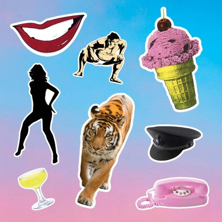
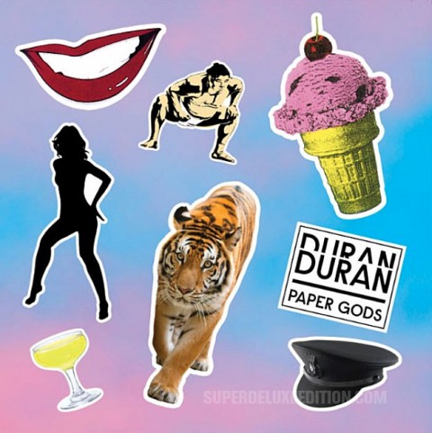
Duran Duran / Paper Gods LP cover

Although this artwork “is not final” the above image is expected to be the cover of Duran Duran‘s fourteenth studio album, Paper Gods, which will be released in September.
The album cover references visual iconography of Duran Duran’s past, including the the lips from Patrick Nagel’s Rio cover, a Chauffeur‘s cap, the sumo wrestler from the Girls On Film video, and – a weird one this – the ice cream from the cover of Perfect Day, the lead single from the rather derided Thank You album.
There will be various bundles (with T-shirts) available via Warner Music stores (no pre-orders on Amazon yet) and the deluxe edition will come in an embossed sleeve and is expected to include three bonus tracks and include a sticker sheet which features images from the cover and others – Lauper alert!!
Paper Gods is due for release on 11 September 2015 (18 September in the US). The first single Pressure Off is expected to available any day now. What do you think of the artwork? Leave a comment and let us know.

65 Comments
65 thoughts on “Duran Duran / Paper Gods LP cover”
Leave a Reply
You must be logged in to post a comment.


 Reviews
Are you sure that “Cherry Ice Cream Smile… I suppose it’s very nice” is referencing ‘Perfect Day’?
And the black silhouetted woman is a James Bond icon, and always will be. A View To A Kill maybe?
why choose lindsay lohan over a real singer.rihanna ? beyonce? katy perry ?
great song with janelle monae – she clearly owns song. most tracks sound like b-sides. weak.inane . blande. we want “rio” and “seven” and “liberty” again but we get “meddazaland, “pop trash” and “all we need is now”.it’s closer to Arcadia (brilliant) than anything else.gimme 5 brilliant singles, 4 brilliant lp tracks and only 2/3 tracks for experimental.non commercial tracks i can skip.
what percentage of people think it’s a greatest hits. snake ? tiger=tiger tiger.is the pink telephone and champagne glass and saxophone references to “rio”.
I like the song. Great chorus, very nice for the summer.
I could care less what the cover looks like.
During the pre-digital era, the cover art will be the “deciding factor” before buying the album. Nowadays, when internet provide more options to promote/sell new material, the function of the cover art become less and less. How often do you get new customer visiting physical record stores to buy an album? Unless if the album was out of production and wasn’t available on internet.
The Observer ran an article with the designer in 2012: “Who Is Alex Israel, And Why Should I Care?” It’s a very good question.
I suspect its just artwork for Pressure Off digital release. God only knows why people are getting so stressed, its just art!
Mike, how do you know if anyone is getting stressed? I’m not seeing that.
For such a stylish band they don’t half get it wrong sometimes. The font for the graphics are fine but the rest of it stinks!
And in true DD fashion they’ve messed up the single release already, not officially available in the UK but it is elsewhere
I never usually comment on sleeve designs, but this is so bad. It would take less than 15 minutes to create something better than this!
Paul,
How can the album be released on different dates? Starting July 10, 2015, everything should be released on the same day worldwide (every Friday).
I don’t like the cover.
I am more interested in an official release of the Steve Thompson remix
of “A View To A Kill”.
Yes, I agree Daniel. There is a great opportunity to do a RSD release for the AVTAK 12″ single with this unearthed mix. An opportunity that the band will probably pass on, unfortunately.
As a fan (and despite finding their recent work a bit hit and miss) I am quite interested in purchasing this.
Less interested in the cover artwork (although I quite like the logo).
Even less interested in ordering via the StereoBoutique as I have had bad experiences (admittedly with vinyl) in the past.
Paul, please do let us know when you spot a deluxe edition on Amazon for Preorder. Thank you!
Maybe it’s like Beck’s the Information album, where you will be able to do your own cover with provided stickers.
I can’t believe that the gorilla from the back of the Liberty sleeve didn’t make it on here!
Haha Encroyable!
Please tell me they didn’t find this is the bin at the local art college. Surely no actual “design” went into it? Iconic cover art is officially dead. Not only can I make a cover in Photoshop myself that would be better, everyone else can too. Trust me, it won’t be worse.
I could see this working as the back of the album cover, but I don’t think it works very well for the front.
Garish, unattractive. Definitely not stylish at all. It would have been a more interesting concept, to use paper copies of album covers from their career, carefully “casually” placed along the sidewalk and pavement of a city street. An early Sunday morning photo shoot could see it done, and then all paper covers would be easily retrieved. The achieved Look would speak of the band, and memories from each decade of their career. In the foreground, prominently placed as first visual, would be a white album cover with words in large type: Duran Duran, and directly below that, the words Paper Gods. QUITE EFFECTIVE.
I do hope this current eyesore of an album cover idea isn’t used. I still love Duran Duran, ever since that day I purchased a 7″ UK import single of Planet Earth, back in February of 1981!
Love the term lauper alert but I don’t like this artwork.
I am surprised their last album is so loved, I don’t remember that much about it.
Wasn’t the release muddled with a digital release before a proper release? I am a bit old school and prefer physical releases.
Yes, that was a major error, I think, issuing the digital version first. They felt obliged to add weak tracks to what would have been a reasonably tight album by the time the physical release happened.
Maybe it’s a statement on consumerism, 30 years late and overly explored by countless people. Maybe its irony or maybe they’re acknowledging the band’s disposal nature to a new generation of music listeners (maybe people who saw them at Coachella and were like ‘cool!’ but never gave them another thought).
Maybe they’re acknowledging the iconic nature of their imagery. It wasn’t hard to pick out what elements of the cover represented what sources.
The one thing the band has excelled at more consistently than their music is their style. They’ve always been stylish. Not everyone can do style well.
Stick with style. This just looks cheap and lazy. There’s a 0% chance the album will sound like 80’s Duran, so why make a cover that attempts to capitalize on past history?
Maybe the only way to market an old 80’s band to new consumers is to say, “Hey, you like 80’s music? Look at this, this is SO 80’s!”. Maybe the way to market to people who were there in the 80’s is to say, “Hey, do you miss the 80’s? This is SO 80’s!”. Otherwise, how to explain the recent are from this and Cyndi Lauper and Paul Hardcastle? At least in the latter two cases, it was for retrospectives. I agree this makes more sense as a compilation cover.
Album artwork/design has gone to the dogs. And whatever anyone says, the sleeve of a record can affect how you think of what’s inside.
Couldn’t agree more. I used to design record sleeves back in the day (along with all the related posters, ads etc) and it was my dream job. Was happy to work until midnight many days as I was just ridiculously grateful to be doing it. Graphic designers (the good ones) care deeply about the sleeve, and the musicians (again, the good ones) see the artwork as a continuation of the music. I’m not too sold on the vinyl comeback over the last few years but I am happy to see that a suitable canvas is again available for good graphic designers to show what they can do. Having done plenty of them I can tell you it was hard to work up much enthusiasm for designing postage stam…err, sorry, CDs.
DD had one of the best designers in the business working for them, Malcolm Garrett of Assorted Images who designed their first album, Rio, SATRT, Arena etc. and all the singles that went with. I sincerely hope he’s had no hand in the travesty pictured above.
Glad it’s not just me being overly nostalgic! I am very visually oriented, being into graphic design a lot when I was younger, and today’s efforts make me weep. Compare this new album cover with Seven & The Ragged Tiger. It’s not even on the same planet.
I completely agree. You look at the majority of cover art these days (and I pointing the finger at the majority of Pitchfork featured hipster bands here), and the design aesthetic looks like its been done by a four-year old with construction paper, felt tips pens, pictures of cut out of magazine, and some bloody Pritt stick. Like most of the record industry these days, its complete and utter b******s.
I really don’t like that. It feels lazy. Despite referencing thier past it is poorly done, creatively lacking in all departments.
The comment about Storm’s work does beg the question why more bands don’t put the effort in regarding artwork.
I just hope the artwork does not reflect the musical content.
Its on a par with Born Again by Black Sabbath.
A bland manilla envelope would be an improvement… :)
Harsh…but unfortunately true! Sorry.
I seem to remember all the same comments on the new Paul Hardcastle “19” release.
Put it in a bland manila envelope for all I care…the music inside is what matters!
I always look forward to a new Duran album with optimism and curiosity. Even the worst of their albums have had at least one or two surprise gems. (except RCM – did nothing for me).
Hopefully they will keep the number of versions to a minimum this time. How many different releases of AYNIN were there? It took a long time (and too much money) to track down the various bonus tracks on different releases.
Hate the artwork. Love DD otherwise.
Lauper alert…brilliant! That may well become a proverb on this site!
Don’t care for the design but I”m more concerned about how good or bad the music is. Duran Duran statistically follow up good albums with bad ones. Big Thing and Thank You come to mind. I thought “All You Need Is Now” was their best album ever. I liked every single song except the very last one which was a bonus anyway. I really do hope they follow up with an album that’s equally high in quality. We all know they have it in them. They are an amazing band. Sometimes they have to get out of their heads and simply be Duran Duran, like they did with the last album. If they did that again with Paper Gods, then who cares what the cover art looks like.
I don’t really like it. Referencing old album art is a cool idea, but the execution is pretty lame.
But it’s still better than the horrifying crime scene that is the “All You Need Is Now” album cover. That is the WORST. COVER. EVER!
Well it’s a marked improvement over the muddled cover from All You Need is Now. No cover will ever be as good as Rio’s, but I kinda like this one.
My friends and I are all in agreement that they’ve borrowed someone’s Trapper Keeper. :p
Decades ago, Albuquerque, New Mexico residents (who were only too aware of their eyesore of an international airport); asked the late but infamous architect Frank Lloyd Wright what he thought of said airport after he’d first viewed it. He simply answered: “Unfortunate.”
(Wow! Sorry that was such a long way to go for a punch-line.)
That tiger doesn’t look very Ragged!
Hideous.
Vaguely inspired by Bowie’s The Next Day, with the old references. I’d give it a 4 out of 10.
Feels very “Warhol/Factory” to me which should not be surprising I guess. This band has always had their art sense about them and I appreciate simplicity with meaning. I like it a lot.
Looks better without the typography.
Pretty bad if you ask me but I don’t care. Every album they have released since getting (most) of the original lineup back together have been outstanding. That’s all that counts.
I have felt that way about a number of albums I love though, the most recent being the new Blur. The cover looked silly to me before it came out but the album is a masterpiece which makes me look at the cover differently now if that makes any sense.
I saw a blurred version of this the other day where they still had those items, but just massively blurred/blended into the colourful background. I actually preferred that, but whatever really. I’m looking forward to the music (and I have tickets to see them in November, so bring it on!).
I am one of those who think a cover should represent what’s on the album and be somewhat linked with the music. With all the references to the past, I’m not sure what that indicates about the musikal contents on the album. So the jury has to still be out on that one.
Having said that, they should have gone all the way with the blow-me-up Barbarella doll from Medazzaland, Simon’s golden slippers from Pop Trash and something – anything – from All You Need Is Now, which is a strong contender for their best album ever.
Like others have said, if they’re stickers or peel-and-place vinyl decals (like the VU banana), then it’s fine.
But the equidistant placement of images that are all the roughly the same size, is terrible. If they’re not movable, then why not have some more dynamics in the layout—some larger, some tiny, have a few bleeding off the edge…
I don’t see why they’re referencing old artwork. Does the music reference the tracks that are represented here? I think it’s a bad idea for a band trying to move forward to look back visually, I wonder if they’ll break out the New Romantic outfits on stage!. Could have been a lot more creative given the title. Disappointed given their past brilliance.
Terrible artwork but then it’s a terrible album title as well so at least that’s consistent!
If you go to the following website https://form.warnerartists.com/html/warnermusicstore/WMSMysteryDiscount/ you get a Pot Luck Discount (10, 15 or 20%) for the Warners site. Now, I’ve registered and upon trying my code, it didn’t work. This was yesterday. I tried it again this morning and…surprise, surprise…the site was down for maintenance when I applied the code. Hopefully the site will be back up and whatever issue they’re having with people trying to use the code will be fixed. And yes, would really like to see this up on Amazon to see what, if any, price difference there will be.
They still look great and stylish, as per their recent photoshoot and with the brilliant ‘Duranie-styled’ Girl Panic! video making them still appear class personified – as well as having Monae, Ronson and Rodgers involved – I really had expected something different…even reverting to the b/w styling of ‘Notorious’….
Still feel the same eleven days later….
Make them stickers à la Beck’s The Information and I may buy into the idea.
Otherwise, it’s horrible, in my opinion.
Hadn’t seen the previous answer, LOL
If there’s stickers included in the deluxe edition, they should be of the graphics on the front cover; if they make the cover simply blue/pink cloudy background, it’ll allow the listener to create their own cover.
Doesn’t make it any less slapdash as an album cover though!
This would be the perfect cover for a Greatest Hits Compilation.
Looks like the school folder of a Duran Duran fan circa 1986.
Take that any way you like.
If it’s as good as the last album then I’ll forgive them for the horrible cover
Blame Nick Rhodes, he still thinks he’s a bloody proper artist – lazily referencing Warhol Pop-Art all the time does not make it cool (can you tell i’m a graphic designer ha!
I like it a lot – it’s rather fun and fresh. Much better than some aging band type of shoot or anything overwrought. Very pop art.
What about the cover art? It’s simply horrible. Yes.
There is enough time to change it.
I hope it.
Looks lazy as a design – get that they’re referencing old work, but could have been done much more interestingly – Pink Floyd designer Storm Thorgenson would have used a windswept location and had actual props made to be photographed (see just about anything he did for Floyd & Muse which was photographic!)
Don’t mind it actually