A few enhancements to the SDE site
We have made a few changes to the SDE website that will hopefully enhance your browsing experience, especially on mobile devices…
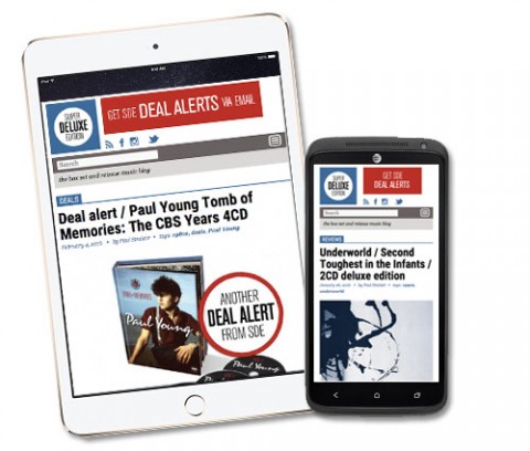
Firstly, we bid farewell to the long redundant ‘middle column’ – it’s gone – allowing more space for the main stories to be enjoyed. You may also notice a few tweaks to fonts and the ‘comments’ links.
However, the main change is that the site is now properly ‘responsive’ and the content reduces and expands according to how you are viewing it. This means on your mobile phones and tablets you should now see the full site, but optimised for those devices. This will be a much improved experience compared to how it was before.
There are more changes to come and some new functionality on the way too. I always welcome feedback, so do let us know if you have suggestions that might improve your experience while visiting SDE.
Thanks,
Paul
(Editor, SDE)
Related Content

28 Comments
28 thoughts on “A few enhancements to the SDE site”
Leave a Reply
You must be logged in to post a comment.
Very nice. Though I didn’t have any problems with the site before – but great to hear that those who are viewing on mobile devices will have a better experience now :)
Also, am I imagining things, or does the site feel a bit slim now? Is it because the quick index has gone? Could probably be a bit wider, but I don’t mind.
Thanks! Same width, but might ‘feel’ slimmer, due to only two columns. Got other plans, so more stuff to come…
Sorry, I just checked some of the pages still in my cache and my post was bollocks. The comments area has indeed widened and the entire site is as wide as before. My eyes were fooled as you might say ;-)
The site is great and 5 years fantastic. Here’s to another 5, 10 whatever!
Great job.
Thanks!
Is there an APP?
No but that is on the SDE ‘roadmap’ :)
A step in the right direction. Well done!
Paul
Just checked it on my Galaxy Note phab & Surface tab and it looks great. Very big improvement. Thanx
J
#weloveSDE
Way bedder! I read SDE mostly on my phone and found the story headline colours (green against white) sometimes difficult to read.
Thanks very much for all your hard work Paul – much appreciated.
Can we have link at the top Paul that expands the recent articles list rather than have them listed at the bottom please? Maybe a link in the menu…
There was a bit of a debate about that… didn’t want too much clutter at the top. Will certainly give it some thought.
Good work, Paul.
My heart sank when I read the headline. My other favourite site redesigned today too and it was dreadful. I can’t even go there any more :;
So when I saw the headline I cringed.
Thankfully, you’ve done a good job! Would have preferred a silhouette of the pet shop boys with a no entry sign as part of the logo, but apart from that it’s really good.
Well done!
Thanks, just trying it out now for my daily intake of news!
Thanks for the update and the wonderful work you do with this site. It is the best resource I have encountered for the music I am interested in maintaining my collection.
Nice updates indeed, site is way better on my phone now!
Paul, this is unrelated to the redesign, but thanks for your work on this site. It’s much appreciated.
You’re welcome!
It’s a good improvement. Would prefer sans-serif fonts for a cleaner look but that’s just a personal preference. I’m grateful for the top content whichever font you choose. :)
Yes, probably will change the body font at some point soon, and make a little bit bigger too.
I have no problem with a font change or size change (don’t we all wish it was a little bigger? ;)) but PLEASE keep it a serif font. I agree sans serif looks cleaner, but serif text (especially in large chunks) is easier to read*. My eyesight is crap and I only use a small 15″ laptop screen so I already have my browser automatically set at 120% zoom.
*There is some debate about that – http://www.webdesignerdepot.com/2013/03/serif-vs-sans-the-final-battle/
Well done!
And you couldn’t choose a better picture to illustrate this article ! :)
Thanks :)
Thanks for the improvements Paul. Greatly appreciated.
Yay, that’s great. I’ll be able to view this site with ease on my phone now. Good work Paul.
Thumbs up from me – pages are faster to load on an iPad and losing the centre column works well. Haven’t tried the site on a laptop yet. Thanks for the improvements.